Black is a color that exudes sophistication and elegance, but have you ever wondered what colors have the power to truly stand out against its dark backdrop? In this article, we explore the captivating phenomenon of which colors are guaranteed to pop when placed on a black canvas. From vibrant hues that create a dramatic visual contrast to subtle shades that possess an understated allure, get ready to discover the magic of colors that truly shine on black.
What Colors Pop Out On Black?
Table of Contents
Contrasting Colors
When it comes to creating visual impact and making a statement, contrasting colors are your go-to option. These colors are opposite to each other on the color wheel, which creates a stark contrast when paired together. Contrasting colors include primary colors, secondary colors, and complementary colors.
Primary Colors
Let’s start with the basics – primary colors. We all remember learning about these colors in art class: red, blue, and yellow. These bold and vibrant hues stand out on any background, including black. Red, with its powerful and energetic presence, demands attention and symbolizes passion. Blue, on the other hand, exudes calmness and serenity. Finally, yellow radiates warmth and optimism. When these primary colors are paired with black, the contrast is striking and captivating.
Secondary Colors
Secondary colors, as the name suggests, are created by mixing two primary colors together. These colors include green, orange, and purple. Green, a combination of blue and yellow, represents nature and harmony. Orange, a blend of red and yellow, exudes energy and enthusiasm. And purple, created by mixing red and blue, signifies creativity and royalty. When these secondary colors are juxtaposed with a black background, they create an eye-catching and dynamic combination.
Complementary Colors
Complementary colors refer to colors that are opposite to each other on the color wheel. When used together, these colors create a vibrant and harmonious contrast. Complementary colors include red and green, blue and orange, and yellow and purple. The striking contrast between these pairs makes them pop, especially on a black backdrop. These combinations are visually stimulating and add an exciting element to any design or composition.
Bright Colors
If you’re aiming for a bold and energetic look, bright colors are an excellent choice. These colors stand out and grab attention, making them perfect for making a statement or creating a focal point. Bright colors include neon colors and vibrant hues.
Neon Colors
Neon colors are synonymous with attention-grabbing and electrifying visuals. These colors are highly saturated and emit a vibrant glow, making them impossible to miss. Neon green, neon pink, neon orange – these hues practically leap off a black background, creating a bold and trendy look. Known for their association with nightlife and urban culture, neon colors add a modern and edgy touch to any design.
Vibrant Hues
Vibrant hues, while not as intense as neon colors, are still incredibly eye-catching. These colors are rich and full of life, radiating energy and enthusiasm. Think of vibrant red, electric blue, and intense yellow. When paired with black, these hues create a striking contrast that instantly draws attention. Whether it’s a vibrant logo or a bold fashion statement, these colors make a lasting impression and give a sense of excitement and intensity to any composition.
Metallic Colors
For a touch of elegance and glamour, metallic colors are the way to go. These colors are reminiscent of precious metals and add a luxurious and sophisticated vibe. The most popular metallic colors are gold, silver, and bronze.
Gold
Gold is the epitome of luxury and wealth. Its warm and radiant aura evokes a sense of opulence and grandeur. Against a black background, gold shimmers and reflects light, creating a stunning visual effect. Whether it’s gold detailing on a black gown or a shimmering gold logo, this combination exudes elegance and prestige.
Silver
Silver, often associated with modernity and sleekness, adds a touch of sophistication to any composition. Its cool and metallic sheen pairs beautifully with black, creating a sleek and polished look. From silver accents on a black car to silver typography on a black website, this combination is both timeless and chic.
Bronze
Bronze, with its rich and earthy tones, adds warmth and character to a black backdrop. This metallic color exudes a sense of history and craftsmanship. Against black, bronze creates a captivating contrast and adds depth to a design or composition. Whether it’s bronze accents on black furniture or a bronze logo on a black product, this combination brings an element of uniqueness and charm.
Pastel Colors
If you prefer a softer and more delicate aesthetic, pastel colors are the perfect choice. These colors are light, airy, and soothing to the eye. Pastel colors include soft pink, light blue, and pale yellow.
Soft Pink
Soft pink, also known as blush or baby pink, is a gentle and romantic color. Its delicate and feminine nature makes it an ideal choice for creating a soft and elegant look. Against a black background, soft pink creates a striking contrast, adding a touch of sweetness and sophistication. From soft pink flowers on a black dress to a blush logo on a black invitation, this combination is both gentle and captivating.
Light Blue
Light blue, reminiscent of the sky on a sunny day, brings a sense of calmness and tranquility. This gentle color creates a refreshing contrast against black, making it stand out without overpowering. Whether it’s light blue accents on a black interior design or a light blue logo on a black website, this combination evokes a sense of serenity and balance.
Pale Yellow
Pale yellow radiates warmth and positivity. Its soft and cheerful hue brings a touch of sunshine to any composition. Against a black background, pale yellow creates a delightful contrast that catches the eye. Whether it’s pale yellow patterns on a black wallpaper or a pale yellow logo on a black packaging, this combination adds a cheerful and inviting element.
Bold Colors
For those who want to make a bold and vibrant statement, bold colors are the way to go. These colors are strong, confident, and demand attention. Bold colors include red, orange, and electric blue.
Red
Red is the color of passion, power, and energy. It is a vibrant and intense color that instantly grabs attention. When paired with black, the contrast is striking and dramatic. Whether it’s a red dress against a black background or a red logo on a black website, this combination is bold and captivating. Red adds a sense of urgency and excitement to any composition.
Orange
Orange exudes enthusiasm, creativity, and warmth. It is a color that radiates energy and positivity. Against a black backdrop, orange creates a vibrant and dynamic contrast. Whether it’s orange accents on a black room or an orange logo on a black advertisement, this combination adds a playful and stimulating element.
Electric Blue
Electric blue, a vibrant and intense shade of blue, demands attention and exudes confidence. This bold color adds a modern and edgy touch to any composition. Against a black background, electric blue creates a captivating contrast that instantly catches the eye. Whether it’s an electric blue car against a black road or an electric blue logo on a black website, this combination is both striking and chic.
Earth Tones
For a natural and earthy feel, earth tones are the way to go. These colors are inspired by the shades found in nature and evoke a sense of warmth and tranquility. Earth tones include forest green, deep brown, and rust orange.
Forest Green
Forest green is a deep and rich shade of green that brings a touch of nature to any composition. Its earthy and natural hue creates a sense of calmness and serenity. Against a black backdrop, forest green stands out and adds depth to a design or composition. Whether it’s forest green accents on a black office space or a forest green logo on a black product, this combination is both soothing and captivating.
Deep Brown
Deep brown, reminiscent of rich soil or dark chocolate, adds warmth and richness to any composition. It is a color that exudes a sense of stability and reliability. Against black, deep brown creates a captivating contrast that adds depth and sophistication to a design or composition. Whether it’s deep brown details on a black furniture piece or a deep brown logo on a black packaging, this combination is both timeless and elegant.
Rust Orange
Rust orange, a warm and earthy shade of orange, adds a touch of warmth and vibrancy to any composition. Its rusty and aged appearance brings a unique character to a design. Against a black backdrop, rust orange creates a captivating contrast that adds energy and interest. Whether it’s rust orange patterns on a black rug or a rust orange logo on a black signage, this combination is both intriguing and inviting.
Warm Colors
Warm colors, as the name suggests, bring a sense of warmth and coziness to any composition. These colors include yellow, red, and orange.
Yellow
Yellow is the color of sunshine and happiness. It is a bright and uplifting color that instantly puts a smile on our faces. Against a black background, yellow creates a striking contrast that catches the eye. Whether it’s yellow accents on a black artwork or a yellow logo on a black poster, this combination radiates positivity and energy.
Red
As mentioned earlier, red is a powerful and passionate color that demands attention. It also falls under the category of warm colors. Against a black backdrop, red creates a striking and dramatic contrast that instantly grabs attention. Whether it’s red details on a black outfit or a red logo on a black website, this combination adds a sense of urgency and excitement.
Orange
Orange, known for its warm and vibrant nature, also falls under the category of warm colors. Against black, orange creates a playful and energetic contrast. Whether it’s orange elements on a black room or an orange logo on a black product, this combination adds a touch of warmth and enthusiasm.
Cool Colors
On the opposite side of the spectrum, cool colors bring a sense of calmness and tranquility. These colors include blue, green, and purple.
Blue
Blue, often associated with the sea and the sky, brings a sense of calmness and serenity. It is a color that evokes a feeling of tranquility and peace. Against a black background, blue creates a captivating contrast that adds a sense of depth and elegance. Whether it’s blue accents on a black interior design or a blue logo on a black website, this combination creates an atmosphere of serenity and balance.
Green
Green, the color of nature, symbolizes harmony and freshness. It brings a sense of calmness and rejuvenation. Against a black backdrop, green creates a soothing and balanced contrast. Whether it’s green details on a black garment or a green logo on a black packaging, this combination adds a touch of nature and tranquility.
Purple
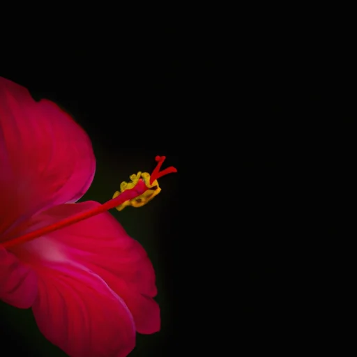
Purple, a color associated with royalty and creativity, adds a touch of luxury and sophistication. Its rich and vibrant hue creates a sense of mystery and elegance. Against black, purple creates a striking and dramatic contrast that captures attention. Whether it’s purple accents on a black accessory or a purple logo on a black background, this combination adds a touch of regality and creativity.
Multi-colored Patterns
For those who love a mix of colors and patterns, multi-colored patterns offer a wide range of possibilities. These patterns add visual interest, complexity, and personality to any composition. Two popular types of multi-colored patterns are geometric patterns and floral patterns.
Geometric Patterns
Geometric patterns, characterized by shapes such as squares, circles, and triangles, create a sense of order and structure. These patterns often utilize a mix of colors, which can include any combination of contrasting or complementary colors. Against a black background, geometric patterns create a bold and dynamic contrast that adds a modern and eye-catching element. Whether it’s geometric patterns on a black wallpaper or a geometric logo on a black website, this combination creates a visually stimulating and contemporary look.
Floral Patterns
Floral patterns, inspired by nature and flowers, add a touch of charm and elegance. These patterns often feature a mix of colors, ranging from soft pastels to vibrant hues. Against a black backdrop, floral patterns create a striking and captivating contrast that adds a sense of whimsy and romance. Whether it’s floral patterns on a black dress or a floral logo on a black stationary, this combination adds a feminine and delightful element.
Color Psychology
Colors have a powerful impact on our emotions and can influence our mood and behavior. Understanding color psychology can help us make informed choices when it comes to design and composition. Let’s explore two categories of color psychology: energizing colors and calming colors.
Energizing Colors
Energizing colors, as the name suggests, evoke feelings of excitement, energy, and enthusiasm. These colors are often vibrant and bold, catching the eye and stimulating the senses. Colors such as red, orange, and yellow fall under this category. Against a black background, these energizing colors create a dynamic and attention-grabbing contrast, adding a sense of liveliness and vigor to any composition.
Calming Colors
On the other end of the spectrum, calming colors bring a sense of relaxation, tranquility, and peace. These colors help create a serene and soothing environment. Colors such as blue, green, and purple fall into this category. Against a black background, these calming colors create a harmonious and balanced contrast, adding a sense of depth and tranquility to any composition.
In conclusion, when it comes to colors that pop out on black, the possibilities are endless. The choice of colors depends on the desired mood, style, and impact of the composition. Whether you prefer contrasting colors, bright colors, metallic colors, pastel colors, bold colors, earth tones, warm colors, cool colors, multi-colored patterns, or colors based on their psychological impact, there is a color combination that will create a striking and captivating look on a black background. So go ahead, explore the world of colors, and unleash your creativity on this versatile canvas.

